The Bold Return of Color in Luxury Home Design
Home & Design
Home & Design
For nearly two decades, soft neutrals have dominated the luxury home market. They’ve served us well, calming, flexible, and easy to style—but today’s buyers are increasingly drawn to spaces that feel intentional and expressive.
As a real estate advisor who has walked through more than 600 homes, I’ve observed a clear shift. Luxury buyers are no longer afraid of color. They want homes that reflect their personalities, tell a visual story, and offer a sense of richness and creativity.
Color, when thoughtfully incorporated, is becoming a new language in high-end interiors. It conveys lifestyle, taste, and identity. And in this new design chapter, beige is no longer the hero. It’s the canvas.
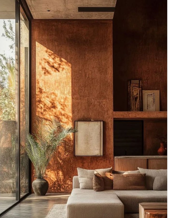
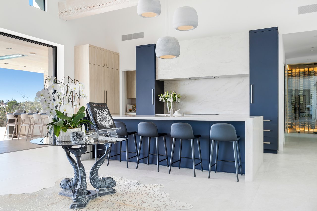
Color blocking is reemerging as one of the most effective ways to define space through design. More than just a visual trend, it’s a spatial strategy. By using distinct or closely related hues in different zones, designers are crafting rooms that feel both architectural and fluid.
This approach works beautifully in homes with open floor plans, especially those with expansive square footage, like we often see in Rancho Santa Fe or Del Mar. Color blocking can separate the dining area from the kitchen or carve a cozy reading nook into a great room, all without adding a single wall.
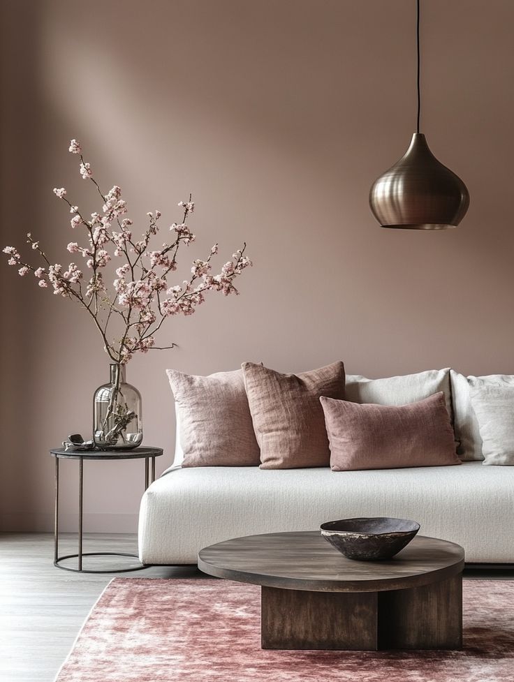
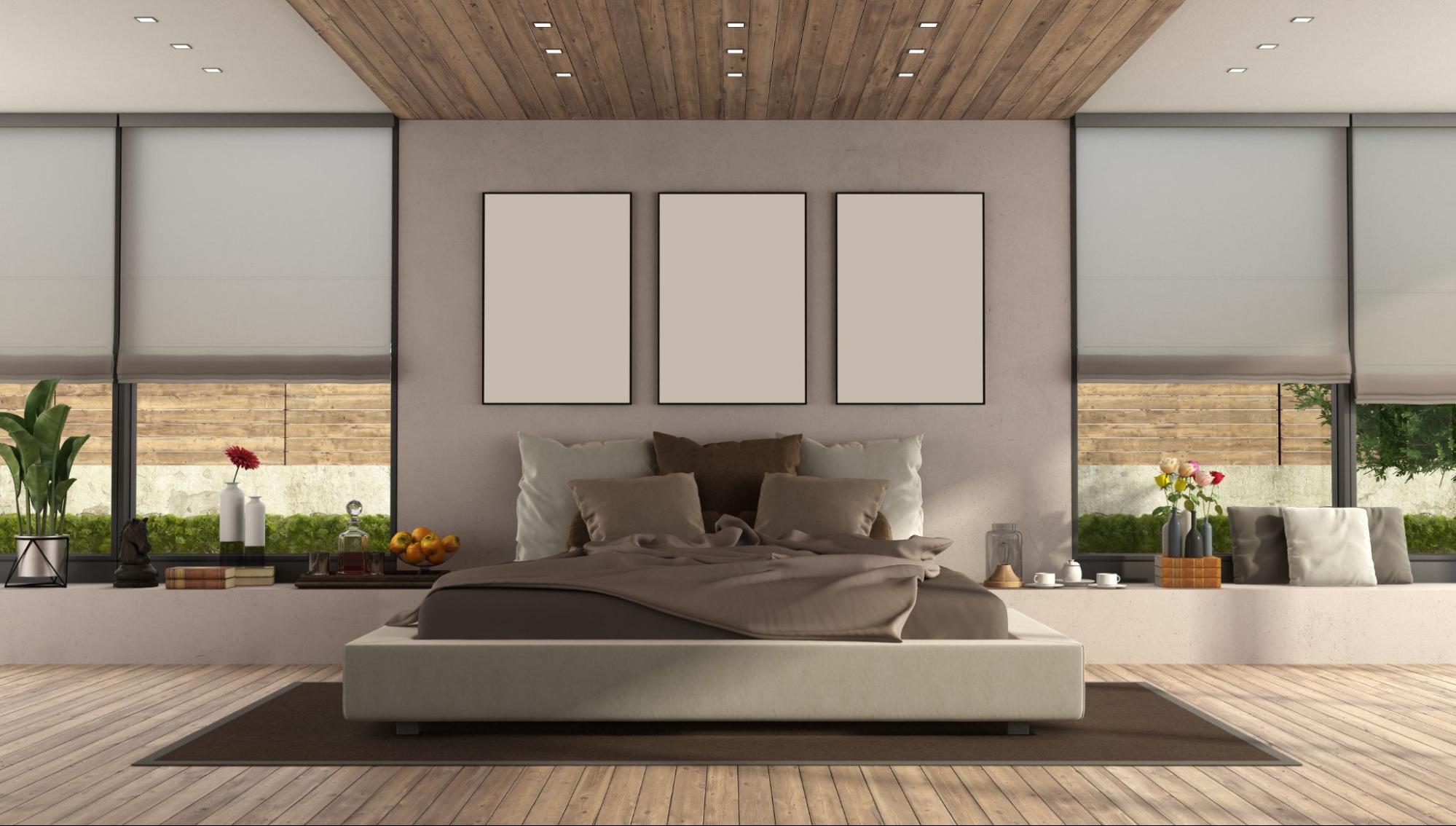
Tonal blocking, on the other hand, brings in layers of the same hue, varying from light to dark, which creates intimacy and depth. In staging, I love using tonal blocking with luxurious fabrics like velvet, silk, and boucle to build a dimensional, elevated feel.
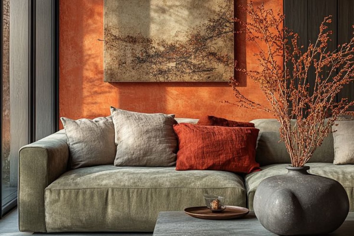
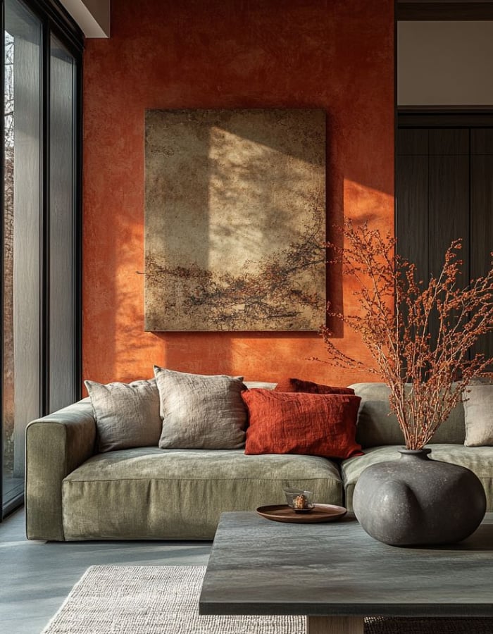
The luxury market is leaning into richer, bolder colors that evoke mood and emotion. These hues create a high-end ambiance that feels curated, memorable, and deeply personal.
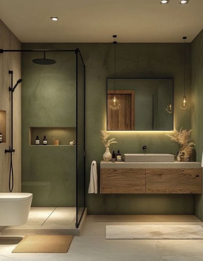
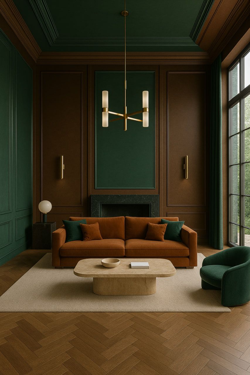
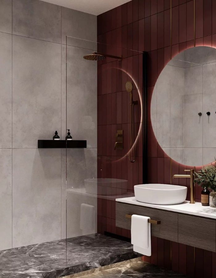
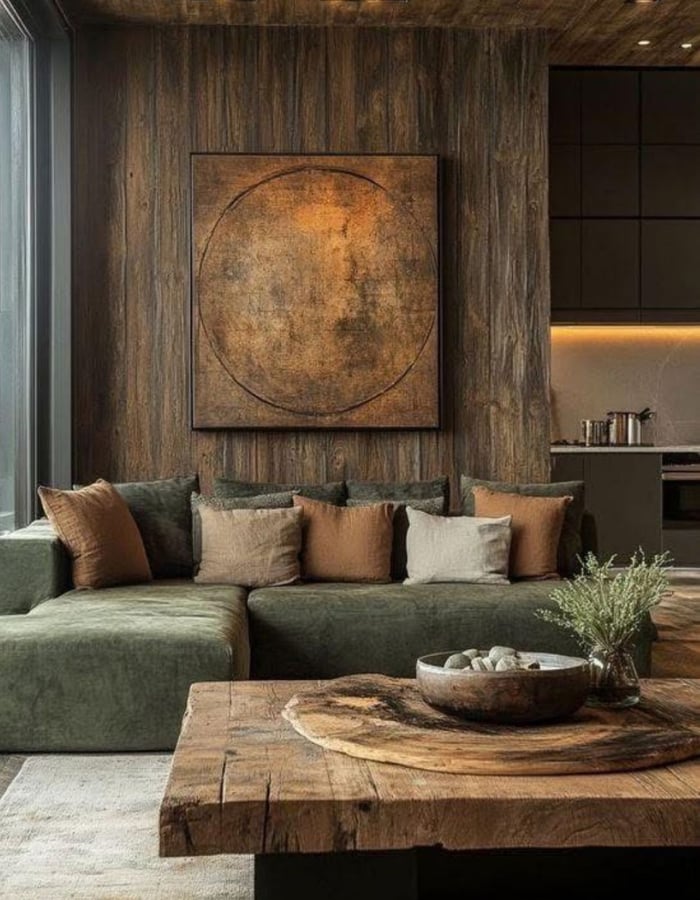
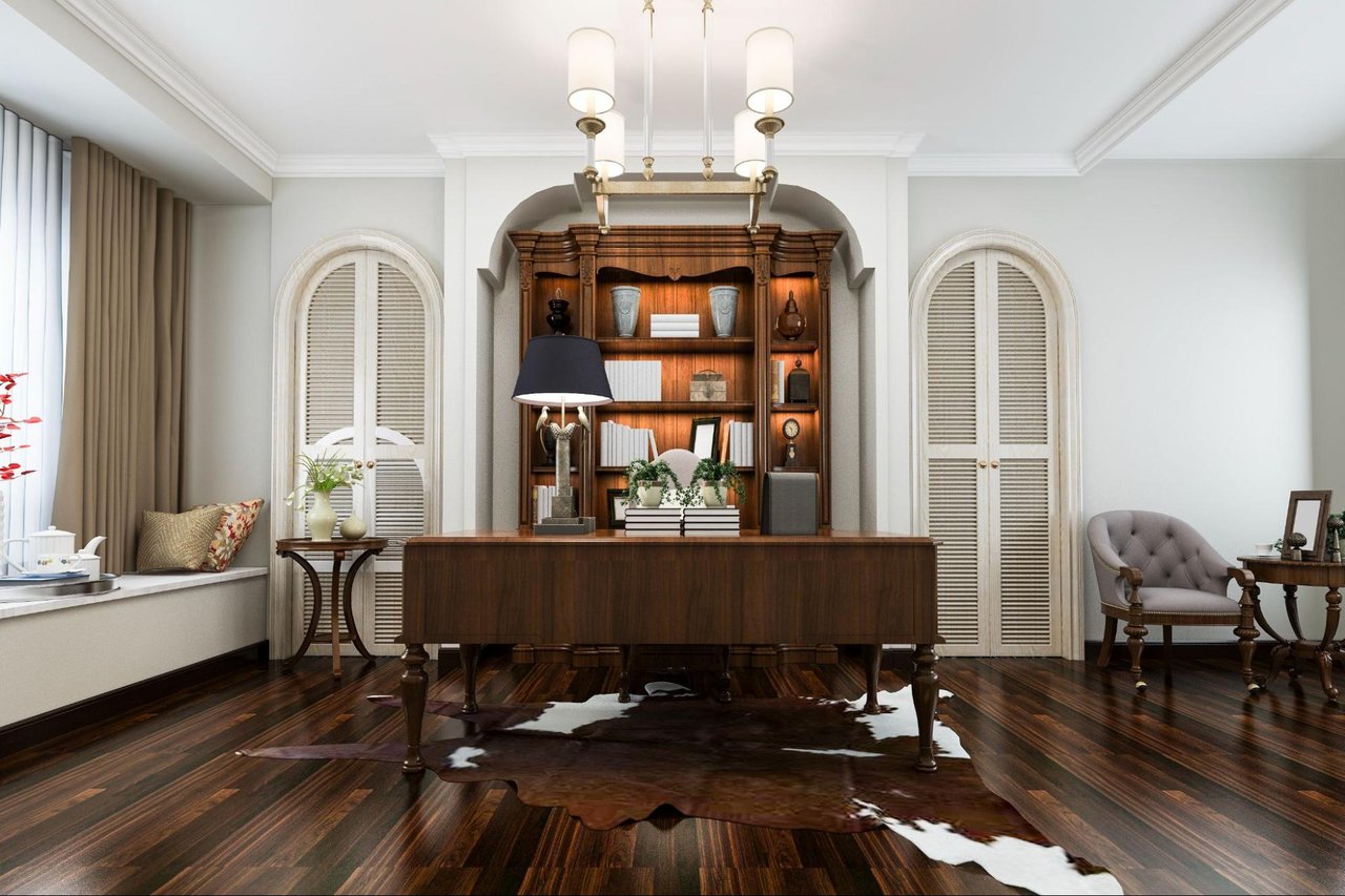
Colors like Bordeaux red, olive green, and deep aubergine offer a level of sophistication that neutral tones often lack. These aren’t trendy, they’re timeless. What matters is how they’re used. Whether it’s cabinetry in a chef’s kitchen or lacquered walls in a study, these shades lend gravitas to any room.
In a recent listing in La Jolla, I incorporated oxblood accents in the office library, which played beautifully against walnut built-ins and brass hardware. Every buyer who walked in commented on the room and how it made them feel.
There’s something inherently luxurious about bespoke detail, and decorative painting is reemerging as one of the most compelling ways to add depth and originality to a home.
This isn’t your grandmother’s sponge painting. Today’s decorative techniques include metallic leafing, modern murals, color-washed ceilings, and hand-stenciled motifs that reflect European craftsmanship.
Clients in Boston’s Back Bay and South End are especially drawn to these historic nods, where old-world architecture pairs beautifully with painterly techniques. Whether you’re refreshing a powder room or designing a dramatic foyer, decorative painting gives you the chance to create a one-of-a-kind statement.
Not everyone is ready to dive into bold hues, and that’s perfectly fine. There are elegant ways to bring in color without overwhelming a space.
Start small. A neutral room becomes dramatically more compelling with the right mix of art, textiles, and custom furnishings. I often recommend colorful interiors for cabinetry or bookshelves, curated pillow arrangements, or tonal rugs to anchor a sitting area.
For clients unsure about color, renderings and physical swatches can be a game-changer. Seeing a fabric or paint in natural light can quickly shift hesitation into excitement.
Color drenching, where a single hue is applied to walls, ceilings, trim, and even furnishings, continues to make waves in high-end design. When done well, it can feel luxurious and immersive. But it isn’t right for every space.
In smaller rooms like reading nooks, home bars, and powder rooms, this technique creates drama and intimacy. In larger spaces, it requires thoughtful execution and layering. It’s not about using just one color, but exploring variations of tone, gloss, and texture.
In my experience, color drenching works beautifully in rooms with strong architectural detail—paneled walls, decorative crown moldings, or custom millwork. It elevates the structure and makes the color feel like part of the home's bones.
In luxury real estate, buyers respond emotionally. The way a home feels often outweighs its square footage. Color, when used correctly, builds atmosphere. It communicates character and gives a home soul.
I always tell clients that color can increase perceived value. A thoughtfully designed home not only photographs beautifully but also stands out in memory after a long day of tours. It creates a visceral impression that lingers long after the showing ends.
Homes that make bold yet elegant design choices are easier to market and often sell faster and for more.
Looking to elevate your home’s interior with bold, thoughtful design? Whether you're buying, selling, or remodeling, I offer expert guidance to help you curate a home that reflects luxury and personality.
Let’s create a space that sells itself. Contact me today for personalized design-forward real estate services.
Melinda Sarkis
[email protected]
(617) 943-8333
Stay on top of the latest real estate trends and get exclusive insights from industry expert Melinda Sarkis! Sign up for our newsletter today and never miss a beat. Join our community of savvy homeowners, investors, and real estate enthusiasts and get the inside scoop delivered straight to your inbox. Don't wait, Sign Up Now!
Stay up to date on the latest real estate trends.
Home & Design
Melinda Sarkis
A quiet confidence is redefining luxury living.
Home & Design
The End of a Design Era: What Today’s Luxury Buyers Are Prioritizing
Home & Design
Melinda Sarkis
Melinda Sarkis
What makes a beautifully designed outdoor space so powerful in today’s luxury market?
Home Buying
Melinda Sarkis
Why Early Preparation Is Key
Melinda Sarkis
What are buyers really looking for these days?

Home Buying
Melinda Sarkis
A Shifting Landscape in San Diego Real Estate

Guides
Melinda Sarkis
Tips for Surfing in San Diego
Home & Design
Melinda Sarkis
Why Color Is Taking Center Stage in High-End Interiors